I updated this site in 2018. I felt I needed a more visual flow of my work that enables visitors to just scroll through the images and read some additional info here and there. So here are some pics of the previous versions of my online presence.
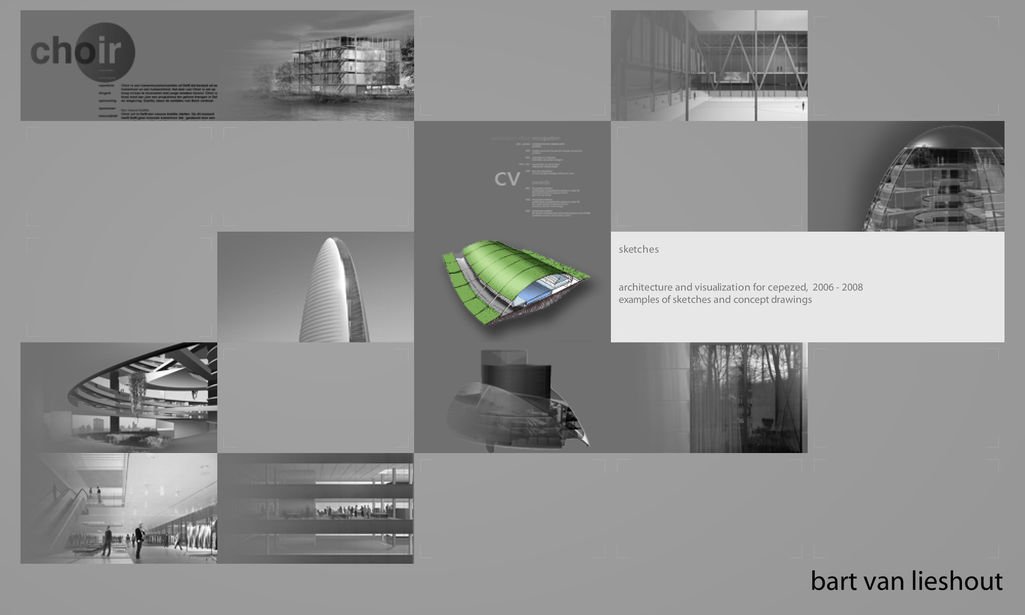
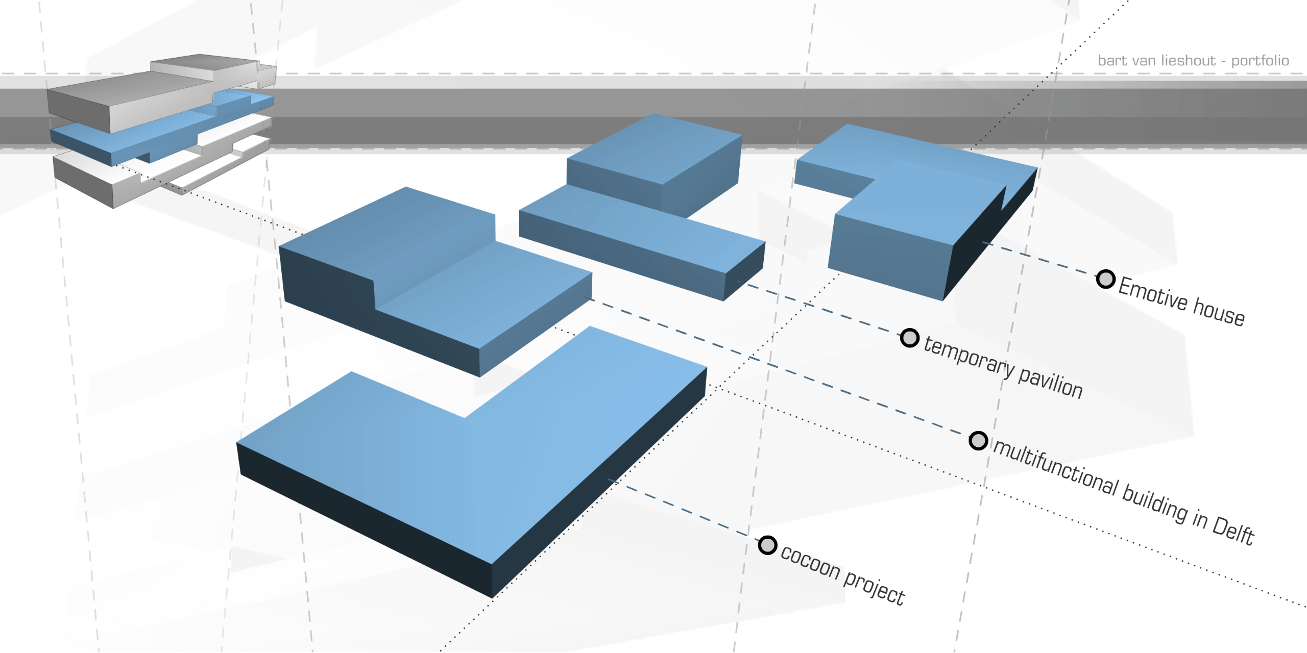
The first online portfolio I created, had a rather exotic navigation. The site was represented as a 3d block that would open up in four layers. Each layer could be clicked and would then slowly explode (3d max export to flash), with each page in the site represented by a fragment.
Grids were hot and everything was flash. I built a flash portfolio that would map projects randomly on a grid. Each project held a number of full-screen pictures and a short description.
All in fashionably small fontsizes.
In 2011, I created a blog site in wordpress. The three-column layout was set in Georgia (the most decent system font at the time).
In 2012, I redesigned my blog to display each article as a card in a masonry grid. The grid was fully responsive, showing more cards on larger screens. At the bottom I listed all the books I was reading at the time.
I also created a physical portfolio in 2012 (21 by 21 cm). Below some spreads from the booklet
In 2016, I migrated to getkirby CMS and redesigned the site in yellow. There were 3 sections on the homepage. Each one would open when clicked to display a range of pages (cases and blog articles). Some pages had a white background, others a yellow one.
The site was set in Neue Haas Grotesk in combination with a custom typeface I created from my own handwriting.