February 2012
Sometimes it is necessary to alter the perspective on a classic master. To bring focus to the magnificent details created centuries ago by a great man.
Last year my choir performed the st. John Passion by J.S. Bach, this year we take on the st. Matthew Passion. So like last year, I designed a poster to advertise the event. This time the poster was of extra personal importance, since I will be singing the role of the Evangelist, which means my name will be on the poster.
I considered to reuse the poster design I made for the st. John Passion, but decided against it for two reasons: At present I have a strong preference for fonts sans serif, like the one I used for the poster I designed for the more recent Mozart Requiem. Secondly, I think the st. John and st. Matthew Passion are very different in character and atmosphere and should therefore not share a single piece of advertisement. With a duration of two hours the length of the st. John Passion is just over half that of the st. Matthew Passion. The story told in the first part of the st. Matthew passion (Judas’ treason and the Last Supper) is not incorporated in its shorter counterpart. And the tone of the st. John Passion is more aggressive, faster and pointier than the majestic double chorus setting of the st. Matthew Passion.
A clear abundance of arguments for a new poster. And of course I would never pass up an opportunity to create a poster design for such an important piece both in musical history as in my personal life – I sung in the boys choir as a child several times and now will take on the title role for the first time.
To advertise the grand drama of Bach’s masterpiece a strong image is needed that will attract attention from a broad audience. The focus should not be on the sharp cruel actions, but rather on the serene suffering, the crown of thorns from the popular choral ‘O Haupt Voll Blut Und Wunden’ and mostly on the atmosphere of sorrow and resignation so brilliantly expressed in the last two choruses of the st. Matthew Passion.
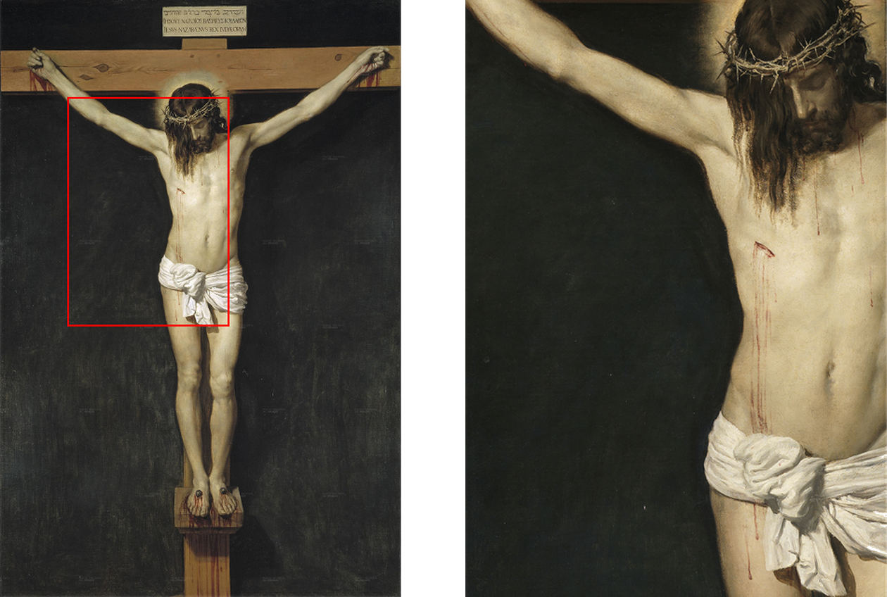
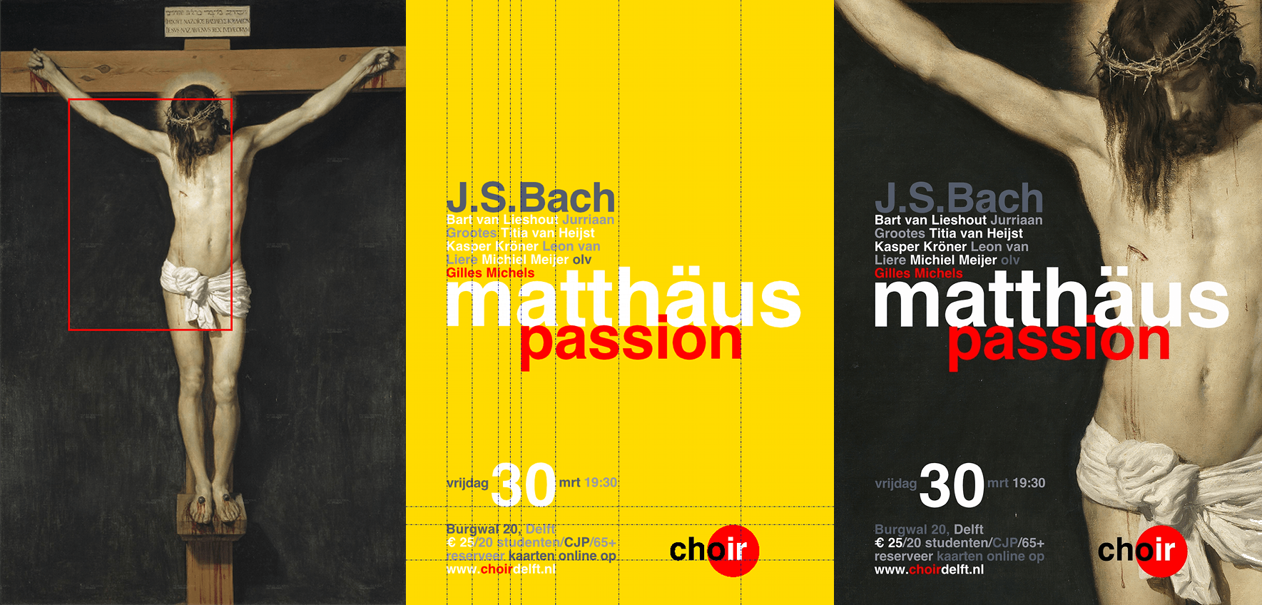
Of course my mind wandered to the crucifixion painted by Velasquez. It is the most amazing crucifixion I have ever come across, and one of the few paintings that totally absorbed my sense of time and place and made me forget I was in a museum completely. I selected this painting for the st. John Passion poster, but rejected it because I felt it to be too stilling to represent the character of that particular composition.
For the st. Matthew Passion however, the atmosphere was perfect. The details on the crown of thorns, the blood and of course the crucifixion scene as the most powerful image enforced by the final ‘Wir Setzen Uns Mit Tränen Nieder’. But the beautiful Velasquez painting has a static composition that does not suit a poster design very well. The poster would not have the two and a halve meter height of the original painting, so any text would render these details obsolete. It was clear that in order to bring focus to the details of the paining something drastic had to happen. I set to work to find a new framing for this crucifixion, forcing attention to the sharpness of the thorns, the stripes of blood and the peaceful face of Christ, avoiding the cross form so often used in rather uninspiring poster designs for this piece.
After some substantial zooming and panning, I decided on a close-up of the upper body of Jesus, not showing the wood of the cross. I panned to the left, showing a large part of the right arm to ensure that people recognize the position of the body as a crucifixion. The top of the head, lowest point of the loincloth (and more important its shadow) as well as the left side of the torso are off canvas, to achieve the confrontational quality of an extreme close-up.
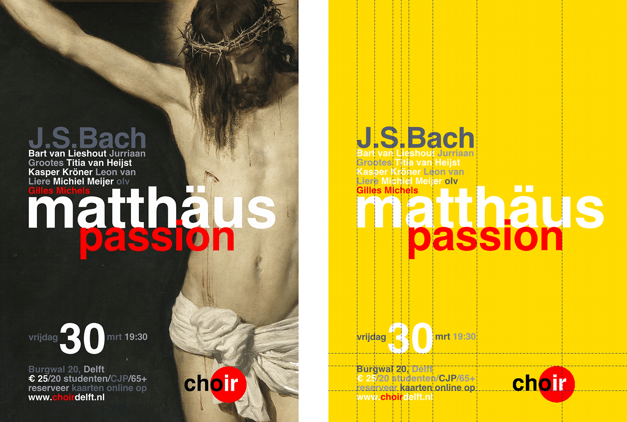
Posting a beautiful painting will not fill the seats at a concert. Some well balanced blocks of information must be added to communicate to the ignorant passer-by for what purpose his attention was caught.
I choose to use no capitals in the title of the piece, and used contrasting red and white for the letters over the dark background of the painting. I used the German spelling for the name of the evangelist, which is graphically so much more appealing than the Dutch ‘Mattheus’. Blowing up the size of the title as large as possible, I positioned the letters over Christ’s body, aligning the letters with the blood flowing from his chest wound. The name of the composer is intertwined with the title of the piece, but I decided to put the names of the soloists between the capitals of J.S. Bach and the high contrast title.
As in my design for the poster of the Mozart Requiem, I placed the practical information regarding location, price and website for reservations on the left bottom of the layout. This created a solid framework of texts to place the last two items: the date and time of the concert and the logo of the baroque ensemble.
After an extremely short experiment with the placement of information above the composers name, I settled on the position of the date and time. The information itself changed quite a bit in search of yet another way to represent this basic information. If you review the earlier poster designs for choir concerts you can spot the variation on this point.
Last but not least, the logo. As always placing a high contrast red dot is as rewarding as it is frustrating. Usually I try to keep all the performers together, but I was quite happy with the graphic block of composer, soloists, conductor and title and there was clearly no place for the red dot in this area. Not to mention that the black letters in the logo are not visible on the dark background of the Velasquez painting. This actually solved my problem, for the logo could only be placed on the lighter part of the image, which meant it would have to go down all the way. In the alignment of the logo, again I followed the blood. Fortunately the facebook comments reveal that the placement of the logo has not gone unnoticed and that it somehow communicates the contrasting spirit that sets this choir and this st. Matthew Passion apart from most competing performances.